Sports · Season schedule
Georgia Smoke
Ten matchups. One graphic.
A whole semi-pro season on a single vertical frame — built so a fan can screenshot one row, crop the rest away, and still know exactly who, when and where.
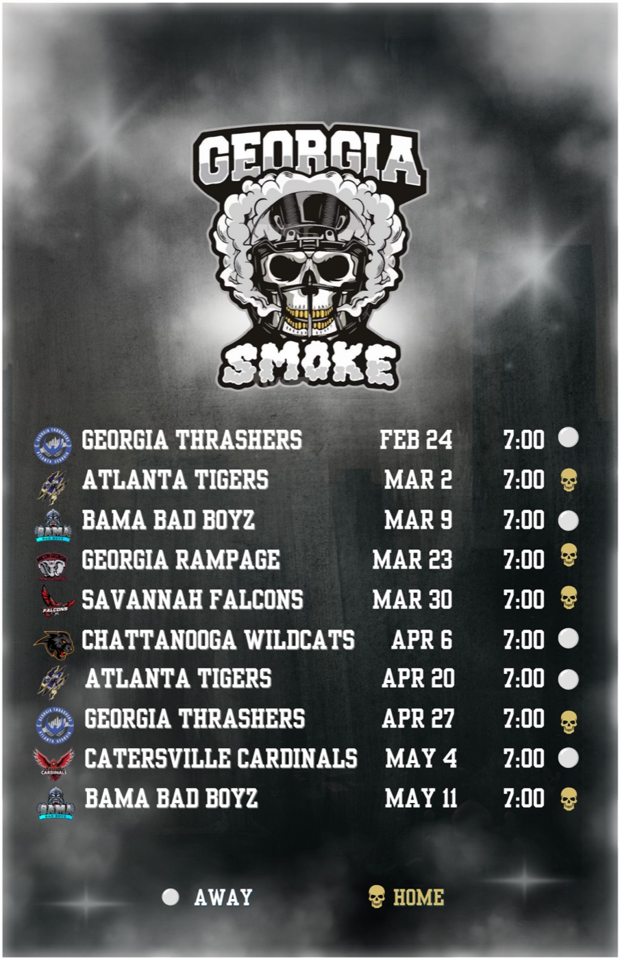
- The crest gets the top thirdThe Smoke mark is doing brand work no type can do — a helmeted skull with a gold grill, wrapped in its own cloud. It sits alone at the top at full size so the club is identified before a single date is read.
- Ten rows, one rhythmA season is a table pretending to be a poster. Every matchup gets an identical row on an identical baseline, so the eye scans down the column instead of hunting around the frame.
- Four columns, in reading orderOpponent crest, opponent name, date, kickoff. Left to right, always the same order — the shape of a row never changes, so by row three the reader stops decoding and starts skimming.
- Home and away, keyedA gold skull for home, a white dot for away — and a legend locked to the bottom of the frame spelling both out. A symbol that needs explaining outside the graphic is a symbol that fails on a screenshot.
- The ground is the nameCharcoal smoke with a few hard light bursts, pushed dark enough to read as texture. The club is called Smoke. The background says it without a single word doing the job.
THE CHALLENGE
Ten games. One frame. No room to be precious.
Georgia Smoke is a semi-pro football club, and a semi-pro season graphic has to survive a job that most design never faces: it is simultaneously the prettiest thing the club posts all year and the most functional. Ten matchups, ten dates, ten opponents, home or away for every one — all of it on one vertical frame, and all of it correct.
That is a genuinely hard layout problem, and it is why so many schedule graphics look the way they do. Squeeze in ten rows and the type shrinks until nothing is readable in a feed. Design the frame first and the information gets crammed into whatever space is left over. Most clubs end up with the same compromise — a stock template, opponent names typed in a default font, the crest floated in a corner, everything centred because centring is the path of least resistance. It reads as an admin document with a photo behind it.
The second challenge was distribution, and it decided everything else. Nobody consumes a schedule whole. A fan looks for their game — the rivalry, the home opener, the one they can actually get to — and they screenshot that. Which means the real deliverable was never a poster. It was ten posters stacked in one frame, any of which has to hold up alone after somebody crops the other nine away.
THE DIRECTION
Design the row. The poster is just ten of them.
So the unit of design became the row, not the page. Get one row right — crest, opponent, date, kickoff, home-or-away marker — and the season graphic builds itself ten times over with a rhythm you can feel scrolling past. Get the page right first and every row is a negotiation.
The row reads left to right in the order a fan actually asks the questions. Who? The opponent's own crest, small but full colour, so a rematch is recognisable before the name is read — three opponents appear twice on this season and the crest is what makes the repeat land as a rematch instead of a duplicate line. Who, again, in words? The opponent name in heavy condensed capitals, the loudest type on the row. When? The date. And? Kickoff, plus the marker.
Every kickoff this season is 7:00, and there was a real temptation to strip a column that repeats ten times. It stayed. Repeated identically down the frame, that column stops being information and becomes structure — a vertical rule that squares the right edge and gives the home-and-away markers something to hang off. It also answers the question a fan asks about a single cropped row, which is the only view that matters.
The palette was never invented. It was lifted straight off the crest: charcoal, white, and the gold from the skull's grill. That gold is the only saturated thing in the entire composition, which is exactly why it can be trusted to carry the one piece of information with real consequences — whether a fan needs to drive.
THE SYSTEM
A schedule is a system whether you design one or not.
Ten rows built by feel will drift. Baselines wander by a few pixels, one long opponent name gets tracked tighter than the rest, a crest sits a hair low — and none of it is nameable, it just makes the graphic feel amateur. So the rules got written down before the first row was set, and then nothing on the frame was allowed to be a judgement call.
Six rules. Deliberately rigid, because rigid is what makes ten repetitions look intentional instead of tired.
- R—01One row, one game, one baselineFixed row height, fixed baseline, fixed column positions down all ten. Nothing nudges to fit — if a name is long, the type system handles it, not the layout.
- R—02The crest identifies, the name confirmsEvery opponent's own mark leads the row at a consistent size. Colour and shape are recognised faster than words, so the crest does the first pass and the name settles it.
- R—03No symbol without a keyGold skull for home, white dot for away — and the legend is locked to the frame, not to the caption. If the meaning lives in the post copy it dies the moment the image is screenshotted.
- R—04The palette comes off the crestCharcoal, white, grill gold. Nothing new invented, no gradient the club doesn't own, and the gold spent only where it means something.
- R—05The ground is texture, never subjectSmoke is atmosphere and it stays atmosphere — pushed dark, blurred, contrast pulled down. White type carries a dark outline so it survives crossing a bright plume.
- R—06Every crop is a deliverableThe full vertical is the master, but the frame is set so any single row survives being cut out of it. Delivered sized for every platform, nothing left to auto-crop.
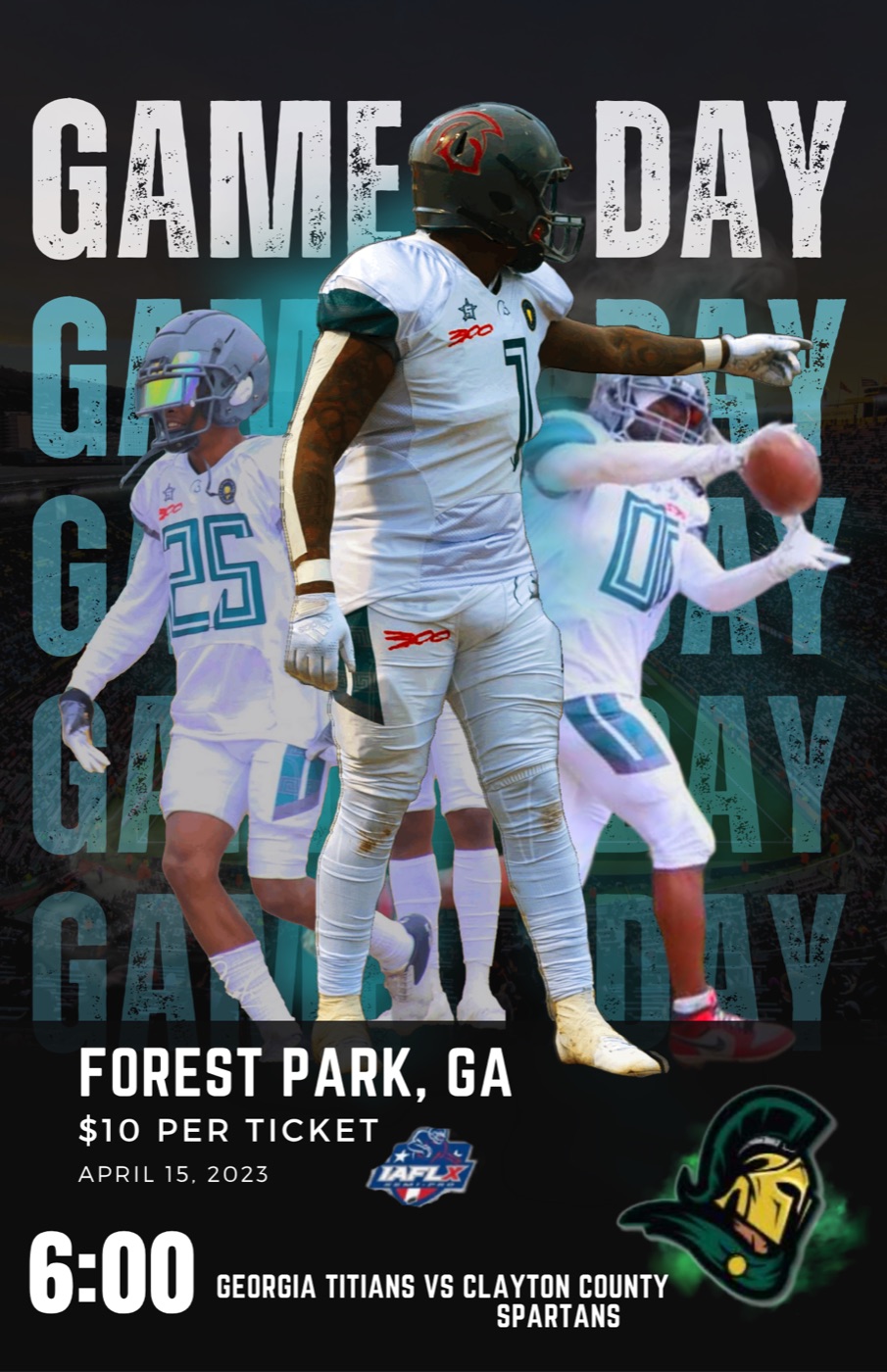
- Two speeds of the same seasonThe Smoke schedule is the map — printed once, referred back to for months. The Titans game-day poster is the alarm: one matchup, one week, maximum volume. Same discipline, opposite job.
- Where a poster can shoutWith one game to sell, GAME DAY can repeat down the whole frame as pure texture and the players can be cut out at full height. A schedule has ten of everything and can't afford that; a matchup poster has one of everything and would be wasted without it.
- Same information, different weightVenue, ticket price, date, kickoff, matchup — the Titans piece carries more detail per game than the Smoke schedule does, because it only has to carry one. That's the whole trade a club is making when it picks which graphic to post.
- Why a club needs bothThe schedule creates the plan. The game-day poster interrupts it. Neither one does the other's work, and a season run on only one of them leaves attendance on the table.
THE EXECUTION
On a schedule, a wrong date is a broken graphic.
Most sports graphics can only be ugly. A schedule can be wrong, and wrong is worse — a beautiful frame with the Mar 30 kickoff a week off sends people to an empty field. So the build front-loads the data and treats the art as the second half of the job.
- Take the season as a list firstOpponent, date, kickoff, home or away — ten rows in plain text, confirmed by the club before a single pixel is placed. Design never starts on unverified information.
- Set the grid before the artRow height, baselines and all four column positions get locked while the canvas is still empty. Every later decision is made inside that grid, which is what stops the drift.
- Place the crest at the size it can surviveThe Smoke mark goes down at full strength in the top third, and the opponents' crests get sized against the row rather than against each other — so a busy crest and a simple one land with the same weight.
- Set type for the smallest readerHeavy condensed capitals, outlined in the ground colour, checked at thumbnail before anything else is judged. If a row fails at the size a phone actually renders it, the row is wrong, not the phone.
- Build the smoke last, and push it downThe background is composited after the information is finished and then knocked back until it stops competing. Nothing gets added to a schedule that makes a date harder to read.
- Proof, approve, ship the setWatermarked draft back to the club for a line-by-line check against their own fixture list — dates and home/away read twice. Two revision rounds are standard. Final files out, sized for every platform, released on approval and the club's to keep.
THE RESULT
Every single matchup got screenshotted. That was the brief.
The season schedule shipped, and fans screenshotted every single matchup. Not the graphic — the matchups. Ten separate rows, saved ten separate times by people who each wanted a different game. The thing the layout was built to survive is the exact thing that happened to it.
That is the whole claim, and it's the only one worth making here. No reach figures, no follower counts, no engagement screenshot — none of that was measured, so none of it gets sold on this page. What is verifiable is what the club said: the schedule looked pro-level, and fans took it apart row by row and passed the pieces around.
Which is a better outcome than a graphic that gets admired once. A schedule that lives in camera rolls keeps working all season — every screenshot is a fan who set their own reminder, and a semi-pro club's gate depends on exactly that.
Our season schedule looked pro-level. Fans screenshotted every single matchup.
Georgia Smoke · Semi-pro football
The work, on paper
Same system.
Your season on it.
Season schedule graphics run on exactly this structure. The row is designed, the grid is written, the rules are set — so the only thing that changes is your fixtures, your crest and your colours. Send the season as a list and it comes back as a frame.
Clubs, AAU programs, trainers, camps. Schedule graphic, matching game-day posters, editable social posts — same build, same standard.
- ServiceSports Graphics
Team & Program — pricing loads from the studio catalogue.
FROM THE SPORTS LANE
Your move
Build something
with VZN
Tell me what you’re building. Scope, price and timeline confirmed in writing before anything starts.