Legible at a thumbnail
The first place this logo lives is an avatar the size of a fingernail. If the mark dies there, it dies everywhere else too. So it got tested small first and scaled up second — not the other way around.
Branding · Identity · 2025
A nail studio with real clients and no mark of its own. We built the one thing a salon can't borrow: an identity that still reads at storefront size and at thumbnail size, and looks expensive at both.
She called it
“my little nail studio.”
That's the whole problem in four words — and it was never about the size of the business. It was about the size the business looked.
A salon runs on hand-offs. Someone shows a friend a set, the friend asks who did it, and whatever comes up next has to answer for the whole business in about two seconds. A phone number can't do that. A stock font can't do that.
Puffs N Nails needed a mark that survived the hand-off — one shape that works on a storefront, a bag, a business card, a story repost and a 32-pixel profile picture without falling apart in any of them.
Premium, not precious.
The first place this logo lives is an avatar the size of a fingernail. If the mark dies there, it dies everywhere else too. So it got tested small first and scaled up second — not the other way around.
Salon logos love to draw the whole service — the hand, the polish, the sparkle. That's an illustration, and illustrations don't embroider, don't vinyl-cut and don't stamp. We built a mark instead.
The category defaults to script, glitter and gradients — which is exactly why none of it stands out. The fastest way to look like the most expensive studio on the block was to stop decorating.
An identity isn't a logo file. It's four decisions that have to agree with each other — the mark, the colour, the type, and the guide that keeps them agreeing after I hand it over.
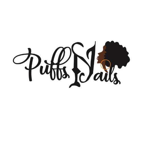
Primary mark · shown on white, the way it ships
The mark
The primary mark is the whole brand compressed into a single asset. It ships with variations — stacked, horizontal, one-colour and reversed — so there is a correct answer for every place it lands instead of a stretched screenshot.
It gets delivered on transparency, which is why it lives on a white plate here. A mark this clean earns its contrast from the surface it sits on; it should never be dropped onto a dark background it wasn't drawn for.
The colour
Every VZN palette is built as a set of jobs before it's built as a set of colours. One shade dominates, one supports, one metal does the premium lifting, and two neutrals carry the type. Decide the roles and the palette stops being a taste argument.
That structure is what makes a small business look consistent across a sign, a receipt and a reel — every asset draws from the same five slots.
Shown in neutral studio tones to explain the structure. These are role placeholders, not the Puffs N Nails palette — her actual values live in the brand guide delivered to her.
The type
A typography system is three answers, written down: what the name is set in, what the sentences are set in, and what shouts. Once those are fixed, anyone can make a post that still looks like the brand — including the owner, on her phone, between clients.
That's the part most logo purchases skip, and it's the reason most small businesses drift back to looking generic within a month.
Roles shown in VZN's own studio faces. The client's typefaces are specified in her brand guide.
Every branding project leaves with the same four pieces. No mystery deliverables, no "final_final_v3.png" — files you own, forever.
From — · typical turnaround —
The same five steps every VZN project runs on. Scope and price confirmed in writing before anything starts.
Two sentences, and the second one is the review that matters: the logo looks like money. That's the actual grade on an identity — not whether the owner likes it, but whether it changes what a stranger assumes about the price before they've seen a single set.
Puffs N Nails walked away owning her mark, her colour system, her type system and a guide that tells her how to use all three. The studio didn't get bigger that week. It stopped looking little.
Your move
Tell me what you're building. Scope, price and timeline come back in writing before a dollar moves.